Since 1948, SMEG has been creating innovative home appliances for a variety of situations. The name is associated with characteristic Italian design such as imaginative elegance, creativity, and high-quality. This component is more than simply a matter of style; it reflects the Brand’s origins and passion. SMEG household equipment, such as the fifties refrigerator or the all-steel stove, become objects capable of influencing the growth of taste and generating relationships that go beyond simply utilitarian necessities. In keeping with the brand’s concept, the showroom design is oriented towards emphasizing the features of the product range that goes above and beyond. “Design is not only what it looks like and feels like,” as Steve Jobs so eloquently put it. “Let’s make showroom design work for you.”
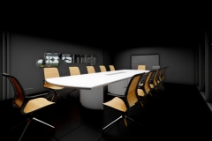
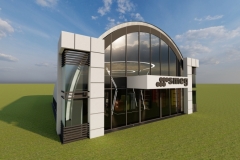
SMEG is a well-known international brand that has been producing household appliances since 1948. It is well-known for its unique product characteristics, color, design, and technology. It is an Italian home appliance manufacturer with headquarters in Gustalla, near Reggio Emilia, in the country’s northwestern region. Since SMEG is renowned as a global appliance provider, it has built several subsidiaries, international offices, and a diverse sales network throughout the world. The company is about to open a showroom in A.S. Fortuna, Banilad Mandaue City Cebu to showcase their products and technology. The design is to have a main showroom area, reception counter, small office for service center and an accessible and barrier free bathroom for a PWD friendly interior.
According to Flyn (2020), a well-designed interior showroom has shown to be critical in increasing sales attractiveness. One of the key design elements incorporated in this showroom design is the play of lights. The mood of your consumers may be considerably influenced by the lighting in your showroom. The idea is to strike a balance between brightness and dimness in the environment; harsh, bright lighting can bounce off product surfaces, causing unpleasant glares (Hamilton, 2019). These lighting elements employed may be of a great use in the blackout design. The Black Out design is defined as an area with predominantly black tones, such as the walls and ceiling. It refers to the area in which the items are displayed or placed, not to the black-shaded object on sale in this design. However, not every spot is black; rather, it is an extremely dark gray. A blackout design is a design that creates a negative space where items can be highlighted for display. This design strategy allows the brand to showcase items in various shades of hue to be highlighted in line with the various lighting strategies used in this space.
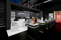
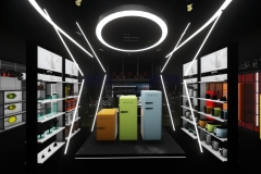
In retail or showroom environments, It is critical to grab customers’ attention and make them notice both the product and the place at the same time. We should not underestimate the potential of eye-catching visual merchandising. The designers included a striking welcome display in the plinth showroom design highlighting the brands’ items in this showroom design. Minimal light seam lines are also strategically used to catch the attention of customers and for additional aesthetics. Customers may be urged to enter the showroom as part of this campaign.
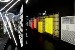
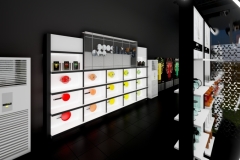
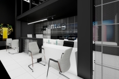
These considerations usually influence design choices in order to attract more customers and boost sales. The retail mix has an impact on traffic patterns, display fixtures, architectural finishes, potential furniture pieces, and other factors. For diverse product kinds and brand qualities, multiple shop layouts and designs are necessary. The positioning of items in a store is influenced by visual merchandising. Visual merchandising is “the language of the store,” according to Ebster & Garaus (2015), since it is how a firm utilizes product photographs or presentations to communicate with customers. It is the science and art of presenting goods in the most appealing manner possible. Furthermore, according to Tutorial Points (2018), the goal of visual merchandising is to get people to enter inside a business and buy something. Customers will think about the store’s general look and offer favorable feedback if it is well-arranged and presented. LED (Light Emitting Diode) lighting is also strategically used in the display areas to attract customers and make the interior look interesting. This phenomenon will be discussed further afterwards in the lighting aspect. For the spectrum display, steel wires are used as a decorative element as this material provides an industrial look and feel to the display and its characteristic of being “see through” allows the spectrum color of the background to be visible from the front. LED tube lighting is then used to make the colors on the background brighter and reflect as its natural ability of being a light color makes it reflective and maximizes the reflection thrown back to the surface.
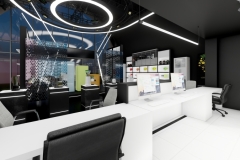
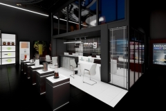
The black color gives elegance and versatility. The use of black is common in modern architecture and interior as it gives in the feeling of simplicity and functionality. The use of black in the overall interior space can be immense and frowzy but pairing it with other colors balances the feel of the interior and this makes a perfect opportunity to provide contrast. This is where the color white comes in. The color white acts as an empty canvas for your design and in this case, for the products being displayed. Psychologically, the color white helps people who suffer from claustrophobia and can also help people with hypertension and anxiety as the neutral color gives in the feeling of calmness according to Foyr (2020). It is important to have colors contrast with each other in an interior like a showroom especially with the design applied by the designers as having two different colors altogether can come in the designer’s advantage which can be used in a strategic manner. Talking about strategy, this plan enables the addition of visual weight to the interior according to Mastroeni (2020). An identical effect can be triggered by contrasting different textures like smooth and rough. This strategic plan easily draws the attention of the eye. As a response to this design strategy, the designers decided to use white and black as a theme contrasted by the neutral color provided by steel and the eye-catching glare of the LED lights for the overall interior. Starting with the cashier reception desk, The furniture is colored in matte white to contrast against the semi-gloss black design on its front. Its colors are also made to be uniform with the theme of the interior space. The same effect was used in the service center and its flooring which is the only white tile flooring from the rest of the interior is intended to highlight the reception area. This effect is also be used all along the displays like the pedestals and the specimen shelf. The sides of the pedestals are black and white on the top which enable the product to be seen against the dim interior just like an art on a white canvas as mentioned earlier. Additional assistance for the purpose of drawing people’s attention to the product was provided with the LED strip lights on the pedestal and specimen display which gives in a “come here” feeling to anyone who sees it. A spectrum display can also be seen in the lower right corner of the floorplan. It is odd to apply a spectrum color with the theme used but if you think positively about it, it stands out from the rest of the displays as it is the only layout with different colors in the interior space making it look unique among the others.
The ceiling has long been overlooked as an architectural feature, but designers are increasingly recognizing it as a separate design aspect. Ceilings offer a versatile platform for lighting objects while also serving as a useful framework for brand display. In this regard, design versatility varies from expressive, technological styles to a purist or even mystical ceiling look that keeps luminaires tastefully hidden. The SMEG showroom is built with an exposed ceiling plan to allow for flexible and adjustable ceiling applications such as interior lighting and ventilations, rather than to save production costs and expenses. All structural and MEP (Mechanical Electrical Plumbing) systems are visible in this sort of ceiling, either in their natural hues or painted. Open ceilings are gaining popularity in practically every field: this architectural style offers rooms a more industrial vibe while also increasing room height. An open ceiling allows for architectural versatility by allowing for distinctive lighting and piping systems. Distribution systems, as well as mechanical and electrical equipment, can be incorporated as decorative elements.
According to Morgan (2011), lighting is vital in any retail setting, whether it’s utilized to draw attention to an in-store focal point or just to provide enough light for consumers to find what they’re looking for. To save energy, the store’s lighting is 100% LED, with varying luminous intensities. Because it saves money on power and lasts longer than normal incandescent light bulbs, track lighting with LED light bulbs is a popular kind of lighting in showroom settings. Using track lighting to produce both warm and cool illumination is a fantastic idea. It is not only useful for creating moods in the environment, but it also draws attention to the items on display. LED strips can be seen used in the display areas such as the Plinths and the specimen cabinet. The LED strips on the plinth are intended to catch the eyes of the viewers and make the guests aware of the dark Plinth’s presence in the black out interior space and to avoid accidents in the showroom as one should not and never understate the importance of health and safety in interior design according to Lizzy (2009). Another application of light strips is applied on the specimen display type shelf which is in the lower left of the floorplan. The use of this material on the specimen shelf highlights the product on the black interior. This strategic contrast catches the attention of viewers making it stand out and attract as we are hence fascinated to the brighter areas in our field of vision. This effect is like how nocturnal insects are attracted to light according to Chantre (2021). This phenomenon is important in this scenario as an appealing package doesn’t only make the image of the store professional and attractive but this also affects the overall sales of the store which is useful in this case as customers will feel the urge to buy SMEG products.
Display fixtures are meant to provide a distinctive design idea while also allowing the maximum number of items to be shown without seeming cluttered. Furthermore, these fixtures and furniture are meant to be flexible rather than permanent for ease of use and movement (Piotrowski, 2016). The pedestal is a frequent piece of furniture in showroom design. These pedestals are specifically constructed to match the store’s aesthetics and are used to exhibit and promote merchandise such as mixers and blenders. A white background is also used underneath the product assisted by the strip lights to contrast against the dark interior which enables the details and design of the product to be visible and noticeable, like having a subject on a white background in a studio. Similar effects can be seen applied in the specimen display and the counter table.
The showroom is set up to allow for free-flowing traffic. The visitor begins their journey at the entry, where they are met by the primary display, where they are enthralled by humorous LED lights that contribute to the aesthetics. The visitor then proceeds to the right side of the interior, where the spectrum display is located. The pedestals in the middle are next, and so on. The interior’s path is circular and free-flowing, making the space breathable and free of traffic. All paths are also intended to readily accommodate a wheelchair, and a PWD-friendly toilet with sliding door is included in the layout for an accessible design. According to Montensen & Spillers, this is not only good for handicapped people, but it also provides a “curb-cut” effect, which implies that the design for PWDs ends up helping a much greater population (2021). As equal human beings, it is critical to create an interior in which everyone has equal access.


Feedback