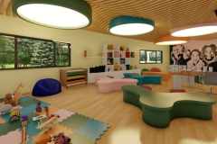
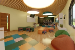
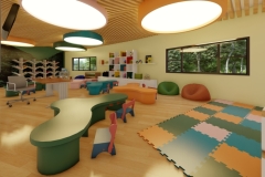
The proposed classroom features a playful and imaginative environment. The interior is designed to be playful and frisky is vital for children – it helps them to be innovative and visionary. The design is imaginative – uses curvilinear patterns to match to structure of the exterior. The ceiling uses wooden claddings with wavy shapes like the sea. The lightings have circular patterns to mimic bubbles in the water. The irregularly shaped tables draws inspiration from corals which the bookshelves represent seaweeds as if the whole thing is underwater. The walls are finished with light chalk yellow color to make it warm and welcoming. Yellow also stimulates creativity, positivity, and happiness.
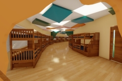
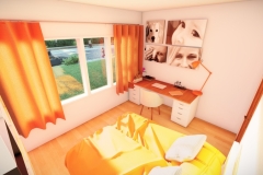
The sleeping area for the orphans is designed in a playful approach just like the classrooms. The ceiling features and irregularly deformed body with rectangular shapes colored with non depressing colors. Color psychology in this space is very important as most orphans are suffering from mental problems and depression. Sections in the hallways are cave like passages to make it playful and imaginative.
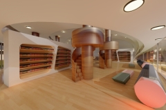
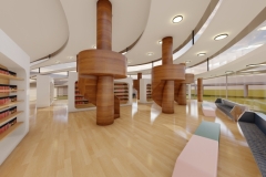
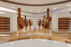
The library is designed to promote learning in a playful approach. The benches are shaped like pencils and the tables as erasers – this idea should call out the idea of studying in this space – suggesting to the kids to do research and schoolwork in the library. The poles feather kiddie space on top so the kids can lie down while reading books. This makes the library exciting as it creates the atmosphere of playfulness where the kids can read books in treehouses.
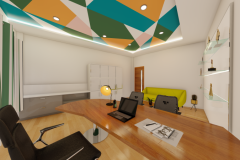
In contrast to other spaces, the principal’s office is designed in a more minimal and formal approach. The ceiling matches the hallway pattern. The colors in the pattern is a combination of Nippon colors used in the structure. The trophy area is designed in glass shelves with LED strips illumination to match the ceiling cove lighting. The walls are colored in garden earth white to project a calm and tranquil environment.
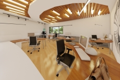
The faculty room also takes inspiration from the structure of the building. The ceiling features wooden cladding mimicking the lines in a shell incorporated with a neutral white curve inspired from the shell. Like the principal’s office, the faculty features a more formal feel through through neutral and warm paintings. The layout of the furniture is inspired from a shell that is snapped in half.
The cafeteria is at the second floor where the children can easily grab food during their break times. A fiberglass is on top of the tablets to promote health and safety during these pandemic times. The cafeteria features natural colors like beige, brown, and green to create a warm and relaxing atmosphere in the interior. Beige is perfect for turbulent times in life as it introduces calmness and certainty according to most feng shui literatures. Green reduces anxiety, tension, anger, depression, and fatigue.


Feedback