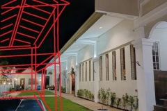
Renovating a church

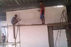
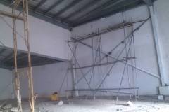
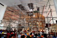
Renovating a church requires a lot of scaffolds since most big churches such as catholic churches have very high ceilings. You need to secure your workers when they work – thus you need a lot of scaffolds.

Some workers are comfortable with metal scaffolds while most workers especially those coming from the rural areas prefer bamboo.

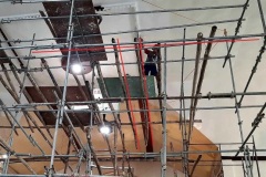
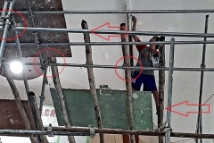
In this example project we set in Cordova parish, you can observe the combination use of metal and bamboo scaffolds – this is not because of workers preference but a matter of choice since there is an abundance of stock bamboo from from the previous renovation lying around.

As you can read from our previous article regarding bamboo scaffolds, bamboo is relatively stronger than steel with the additional benefit of it being flexible, and the abaca string or even the nylon string used to secure the bamboo – normally don’t easily slide through, compared to metal fasteners – thus workers are generally more comfortable with the bamboo scaffolds. Metal scaffolds are only popular in city areas since bamboo is hard to find in the city.

When contracting church projects, one has to give the best pricing – very minimal profit – even sometimes, if you can, remove the profit, and give the church a purely service oriented contract since the church is the house of God thus you can consider a church project as your own giving back to God. Churches rely on donations from parishioners thus you can notice if there is ongoing project in the church – the priest has to sometimes even beg during mass for more donations to finish such project.

San Pedro Calungsod Parish Pastoral Building

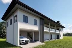
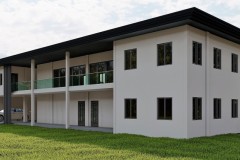
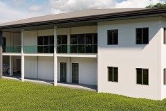
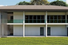
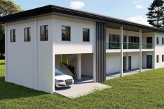
This parish office building (pastoral building) in San Pedro Calungsod Parish in Sogod Cebu is a fully donations funded structure and will be the first formal office structure for this parish.

Currently, the business office is one small room on the way up to the priest’s quarter.

This structure will surely be a blessing to the parish officers, pastoral council, the priest, and the community so that they can already formally hold parish meetings and plannings, and other activities in a formal – larger structure.

The ground floor will have a 2-car garage space so that two guests’ car can fit adequately.

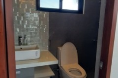
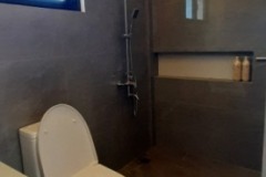
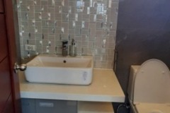
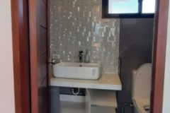
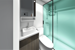
The dual bathroom greets the garage so that those needing to use it do not have to go far to find it, and if a guest is coming, then he will be ready to use the bathroom especially that most guests might be coming from the city which is a two-hour ride.

Further, the ground floor will have the parish office and its own storage, the priest’s office, and the Caritas office – an age-old welfare organization established by the Roman Catholic church. These are vital offices for the various parish services.

The second floor will have a meeting room where various community organizations can book in advance for their meetings – this meeting room is just right beside the stairs for easy access. Next, just greeting you near the stair, is the biggest room – the function room where events can be held such as community parties and such, then there will be 2 other offices next to the function room – another bigger office is the catechism office where the parish catechists can stay to prepare their lessons and other plans…

As this building is currently still just in the funding stage – needing to raise adequate funds for a standard structure of this size, everyone is welcome to help build this office. Currently the parish, through the parish priest is trying to raise funds through various activities such as concerts, dinner for a cause, and other possible acceptable fund-raising activities. The ASIN Band Concert is already booked at the Tabuelan Astrodome for this coming October 21, and a second one is right after it – on October 22 at the International Eucharistic Congress (IEC) Convention Center near Landers Supermart in Cebu City.

We all know concerts these days are not really big fund raisers and the community donations will hardly raise the needed funds since the parish is in a remote rural area, then everyone is called to help fund this noble project. If one big donation can be made by an individual or a corporation, then one room or a portion of the building can be named after him or to that corporation with a big heart. It is ingrained in the catholic set of beliefs that every help you can give to a parish will greatly merit your soul. Well then, if one generous person or corporation can fully fund the entire project then the entire building will have to be named after that person or that organization. Let us know if you would be able to lead us to someone who can finance or help to finance this noble project…

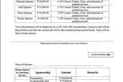
If you feel you can sponsor or help find sponsors for the concert events for this cause, here’s a sponsorship cover letter you can use: You will be rewarded with snacks and transportation package and free tickets depending on the sponsorship package you can help to close for this event…

Here’s a sponsorship opportunity for your brand to:

  1. Build brand awareness for your brand;
  2. Triple your sales;
  3. Improve your brand image since this is a Church event…

Catch Lolita Carbon and the ASIN Band in Cebu (https://fb.me/e/30ztDGy9x) , on Oct 21, 2023 at the Tabuelan Astrodome, and then on Oct 22, 2023 at the IEC Convention Center beside Landers Cebu.

Since this is a two-day concert tour event, your brand, products, and services will be exposed to a large expected combined audience of at least 10,000-15,000 concert goers, and at least 500,000 – 1,000,000 people who will see the ads both online and offline but will not be able to attend the concert events due to the limited seating capacity for both venues…

This is for the benefit of the proposed San Pedro Calungsod Parish Pastoral Building construction in Mohon Sogod Cebu…

Your sponsorship or group ticket support for this noble project will go a long way for your brand and for the people of this parish…

Since ASIN have classic intellectual/nationalistic/cultural themes in their songs, the expected audience are nationalistic, intellectual, and culturally oriented people in the 40-60 age brackets – the golden age brackets – those who can afford your brand products and services…

Please see attached Sponsorship Package Details…

To order tickets or to become a sponsor of this event, kindly leave us a COMMENT REPLY below…

I-Beams in Constructing Strong and Reliable House and Building Structures

When it comes to constructing houses and building structures, ensuring strength, durability, and stability is of paramount importance. One essential component that plays a significant role in achieving these qualities is the versatile I-beam. Let’s explore the use of I-beams in the creation of robust and reliable structures.

What are I-Beams?

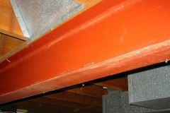
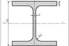
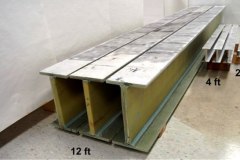
I-beams, also known as universal beams or wide-flange beams, are structural steel members characterized by their distinctive “I” shape. These beams consist of a vertical web connected to horizontal flanges at the top and bottom. The unique design of I-beams enables them to distribute weight evenly along their length, making them ideal for bearing heavy loads and providing structural support.

Strength and Load-Bearing Capacity:

I-beams are renowned for their exceptional strength and load-bearing capacity. The vertical web of the I-beam resists shear forces, while the top and bottom flanges handle bending moments. This distribution of forces allows I-beams to efficiently carry significant loads without excessive deflection or structural failure. Whether it’s the weight of multiple floors, roofing systems, or other heavy elements, I-beams provide the necessary support for a sturdy and reliable structure.

Structural Versatility:

I-beams offer unparalleled versatility in construction applications. Their standardized dimensions and wide range of sizes make them compatible with various architectural designs and structural requirements. Whether used in residential, commercial, or industrial construction, I-beams can be tailored to fit specific needs, such as longer spans or higher load capacities. Architects and engineers can select the appropriate size and shape of I-beams to ensure optimal structural integrity and safety.

Efficient Material Utilization:

One of the notable advantages of I-beams is their efficient use of material. The design of I-beams concentrates material at the outer regions where it is most needed to resist bending forces, resulting in a structurally efficient and lightweight beam. This feature not only reduces construction costs but also allows for more flexibility in architectural design.

Construction Process:

The manufacturing process of I-beams typically involves hot rolling, where steel billets are heated to high temperatures and shaped into the desired “I” profile. This process enhances the mechanical properties of the steel, such as its strength and toughness, making I-beams even more suitable for demanding construction applications. The standardized dimensions and quality control during production ensure consistency and reliability in the final product.
Applications in House and Building Construction:
I-beams find extensive use in various aspects of house and building construction. They are commonly employed in the creation of load-bearing walls, floor and roof systems, and structural frameworks. Whether it’s supporting vertical loads in multi-story buildings or spanning wide distances in bridges and industrial facilities, I-beams provide the necessary strength and stability to ensure the integrity of the structure.

In the world of construction, the utilization of I-beams has revolutionized the way houses and buildings are designed and built. Their distinctive shape, exceptional strength, and efficient material usage make them indispensable in creating structures that can withstand heavy loads and environmental stresses. From residential homes to towering skyscrapers, I-beams play a vital role in ensuring the durability and reliability of modern construction projects. With their versatility and standardized dimensions, I-beams continue to be a cornerstone of the construction industry, providing architects and engineers with a robust and efficient structural solution.

The use of I-beams in house and building construction offers additional benefits beyond strength and durability. These beams facilitate open floor plans by eliminating the need for load-bearing walls, allowing for more flexible and spacious interior designs. With the support of I-beams, architects can create expansive, light-filled spaces that enhance the overall aesthetics and functionality of the structure.

I-beams play a vital role in roofing systems, where they provide structural support for heavy loads such as snow, equipment, or solar panels. By incorporating I-beams into the roof design, builders can ensure the safety and longevity of the structure, even in areas with significant snowfall or adverse weather conditions.

In industrial and commercial construction, I-beams are used extensively in the creation of large-span structures such as warehouses, factories, and shopping centers. These beams allow for the construction of wide, open spaces without the need for interior support columns, providing flexibility for various layouts and maximizing usable floor area.

In retrofitting and renovation projects, I-beams are often utilized to reinforce existing structures, strengthening their load-carrying capacity, and improving overall stability. By strategically installing I-beams, builders can address structural deficiencies, support additional floors, or remove load-bearing walls during renovations, providing flexibility in transforming old spaces into modern, functional environments.

The use of I-beams in house and building construction is fundamental for creating strong, reliable, and visually appealing structures. Their exceptional strength, load-bearing capacity, and efficient material usage make them a preferred choice among architects and engineers. From supporting floors, roofs, and walls to facilitating open floor plans and spanning wide distances, I-beams play a pivotal role in shaping the modern construction landscape. As technology and construction techniques continue to advance, I-beams will undoubtedly remain a cornerstone in the industry, contributing to the creation of innovative, safe, and sustainable structures for generations to come.

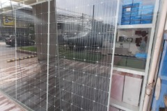
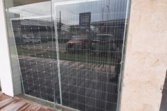
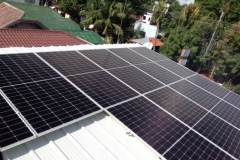
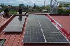
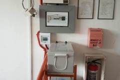
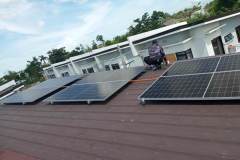
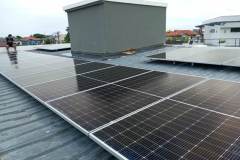
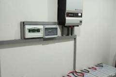
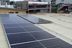
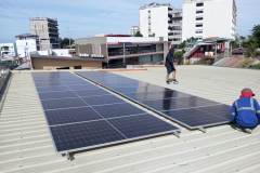
Now is the best time to go Solar…

The summer is really heating up and so your aircon bill is also soaring very high up in the sky. In a tropical country like ours, aircon is very common because our climate is not only tropically hot but is also very humid like in a sauna – humidity and heat is a very uncomfortable combination that is why we all just suck it in and accept to pay very high electric bills because we can’t bear the heat and humidity and so we rely on the air conditioner…

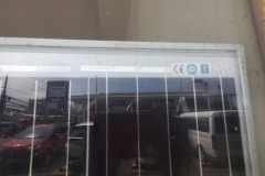
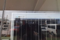
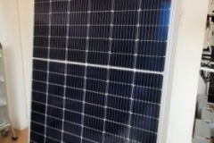
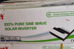
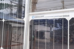
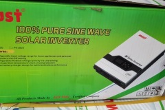
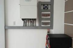
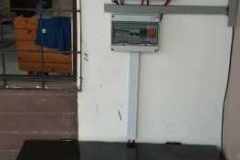
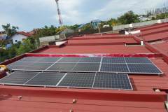
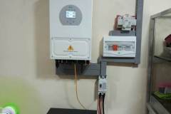
Thankfully, solar power is now made affordable by Asian factories with design and manufacturing costs tailored for the Asian budget. There was a time when a 5kW solar set up will start at least half a million pesos now – thanks to the Asian factories – a 5kW solar set up will only cost you 375,000 pesos and a 3kW set up will only cost you 255,000 pesos, and the panels for these set ups come with a safe 5 years warranty, while the rest of the components in the package comes with 1-2 years safe warranty. There are no moving parts in a solar set up, most components are just stationery and electrical in nature thus you are assured the 1-2 years warranty is already a very safe investment, while the panels which are always exposed to the sun are covered with a 5 year warranty, and since it is glass and solar dielectric to collect the solar power harvest, you can be assured that these parts can go even up to 30 years… Now If you compute that total cost investment for either the 3 or 5 kW set up and compare it with how much you’re paying now for your electric bill, you will certainly see that solar power makes sense in all angles… Those solar set up costs by the way is a package cost which means it covers both the material costs and installation costs.

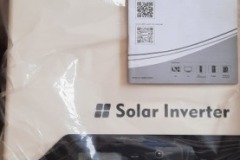
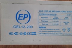
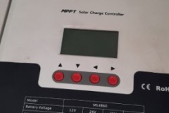
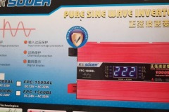
If you have 2 units of 1 horse power air conditions in your house, then you may just opt for the 3kW solar set up, but if you have 3 units of 1hp aircon units and then another 1.5hp unit then you may opt for the 5kW set up. The solar power set up will be connected to your power line so in case there is little sun during the day, then the computerized inverter in the package will adjust to get more power from the grid, and when the sun is shining bright, the inverter will also adjust to get more power from the sun and shut off the grid line – that’s how the solar set up will save you money. By the way, since solar relies on the sun, then naturally you cannot rely on it to power your aircon during the night, so the computer inverter will get power from the grid during night time… The solar set up costs mentioned above already comes with a battery that can power the lights and charge your phones and 1-2 electric fans during night time…

Elegant mid price finish at Pacific Grand Lapulapu

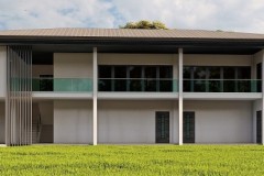
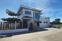
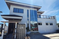
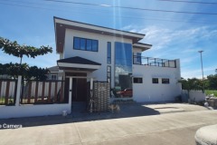
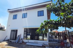
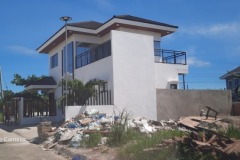
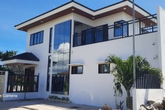
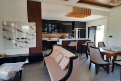
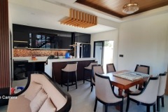
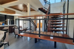
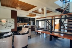
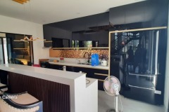
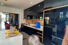
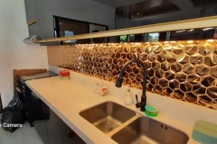
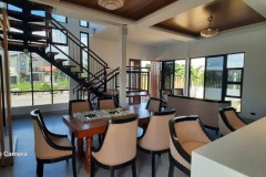
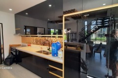
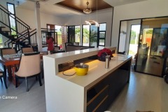
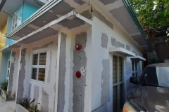
This elegantly finished house owned by a dentist in Pacific Grand Villas in Lapu-lapu City by the Chief Architect Edwin Jacob Roque himself is looking really grand but you’ll be surprised this is just finished with a mid budget. For those looking to finish elegantly with a modest budget this design is for you. The columns are all metal i-beams like the standard now in first world countries especially in Dubai and the USA. Using i-beams can achieve this type of build with your modest budget since i-beams can lower labor time and cost since you no longer have to go through the intricacies of building concrete columns with all its intricate metal works and form works. The interior finishes especially the kitchen, bathroom, and bed cabinetries are also modestly budgeted, but using good color contrasts black and gold gives it a casino hotel type of finish, well achieved by employing a veteran master painter and very experienced and highly skilled carpenters, masons, and painters….

Modern Minimal Scandinavian interior design

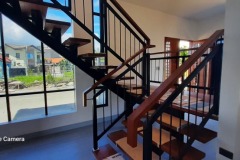
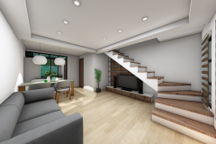
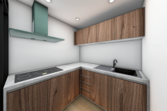
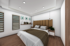
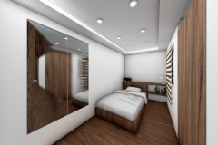
Here’s a touch of modern Scandinavian design for a small home. Only the neutral colors made this a Scandinavian minimalist – neutral colors… And since most people nowadays prefer the modern design thus the cubist appeal. This design thus is a modern minimalist Scandinavian. The colors for the interior will just be white and then wood touches on the cabinets and doors. This design is being implemented in Portville Prime… The glass and stainless railings adds to the modern appeal…
Poseidon Hotel

The spaces inside Poseidon hotel are named after some of his sons – Areion, Pegasus, Chrysomallus, Polyphemus, and Telchines. The hotel offers three kinds of suites. Areion for single suite, from Areion which is an immortal horse, Pegasus for double suite, from Pegasus which is an immortal winged stallion, and Chrysomallus for the family suite, from Khrysomallos which is a gold fleeced flying ram that has a tongue of a human, and lastly, the brand name Poseidon is derived from the Greek word Neptune.

Areion is a studio unit room located at the north west of the hotel. Areion features 1 bed and small kitchen. This suite is the smallest suite offered by the establishment.

Pegasus is a double bed suite located at the north east of the hotel. It is relatively bigger compared to the Areion.

Chrisomallus is a three-bed suite located at the north of the hotel. It is the biggest suite offered by the establishment with two comfort rooms and has more features compared to the two suites above.

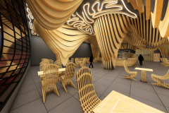
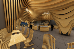
Polyphemos is a restaurant located at the east of the hotel. The foods served are familiar foods. The hotel features a garden where some veggies and spices are harvested. The restaurant features an open view where guests can enjoy the view of the ocean and the vicinity.

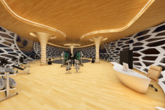
Telkhines is the hotel’s gym located at the west of the hotel. The hotel features multiple workout areas and changing areas. The area features an open view window with an overlooking view of the locality.

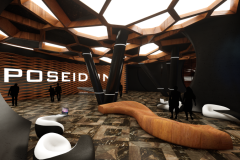
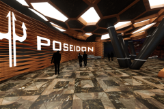
The hotel lobby is designed to focus more on lounging. From the entry, guests are greeted with the reception desk where they may inquire and book according to their stay. Lounging areas are placed next to the gigantic windows of the interior so that guests may enjoy the wonderful outside views from their seats. All lounging areas are made adjacent and reasonably adjacent from the reception so that the receptionist may monitor the guests easily. Comfort rooms are located next to the lobby which are not included in the floor plan, as it is already a separate structure from the lobby, but is just next to the hallway.

The Poseidon is designed in brawny finishes. A semi-gloss black with brown accents and spots of white illumination as kind of neon curvy lights but white LED (light emitting diode) lights. The ceiling features voronoi cubicles with random spots of illumination. The ceiling is inspired from the honeycomb coral, interpreted through a modernist linear approach. Slanted columns took inspiration from Antoni Gaudi’s Sagrada Familia in which the columns are made like tree branches; just that Poseidon’s approach is a more minimalist design. As the interior is dark, strips of LED are placed in the column’s top and bottom for visibility of the column. The wall accent behind the Poseidon logo is inspired from fish scales. Outlines are extruded and curves are sharpened to show versatility and aggressiveness in the design. The floor is finished with Emperador marbles in mosaic pattern to neutralize and balance the combination of black and brown in the interior. Poseidon is made to glow to give a tron (tron movie) like feel in the interior.

The Poseidon lobby is spacious for better accessibility and a barrier-free design for PWDs (persons with disability). Spacing between furniture is 1000 mm, and the ceiling height is at 5000 mm for a bigger space like the abyss of the ocean. The application of rosewood in the interior promotes warmth, and the light reflection from the artificial lighting creates a yellowish reflection which creates the psychological aura of the area being cozy. The round interior of the lobby is inspired from natural cave like formations in corals where fishes take shelter. It’s like the ocean world is interpreted into human version of the shelter in the ocean. The application of rosewood also contributes to the interior’s aesthetics – thanks to its natural wood patterns and at the same time – durable – for long term use.

At the entry you are first greeted by the reception area where you may also inquire or book for a table. Beside the reception is a waiting area where guests may wait for their company or wait for a vacant table as next to the reception is the dining area with a bar on the center. The bar is strategically placed in the center to be adjacent with the whole dining area. Lastly, is a separate comfort room for the PWD, male, and female which is made adjacent to the reception, dining, and bar area.

The spacing in the Polyphemos interior is adequate enough for guests on wheelchair to navigate the interior barrier-free, this enhances movement and circulation in the interior. The Polyphemus is designed to cater 68 individuals enough for most of the people checked in. The Polyphemus features a parametric wavy design which flows along the entire ceiling and columns complimented by parametric chairs inspired from the pantone chair. The design being wavy is to match the theme of Poseidon hotel being about the ocean, and the glass resembles an eye inspired from the cyclops Polyphemos, son of Poseidon. The interior is finished in dark-grey, accented by bamboo finishes. All loose furniture is of bamboo while the ceiling finish is of plastic wood composite material in bamboo finish to reduce weight in the structure; this also enables the production of material to be more affordable and suitable for the interior. The presence of bamboo in the interior gives a warm feel to the environment. Not only does it contribute to aesthetics but it also is one of the most durable and sustainable materials available in the market.

The wavy design of the Polyphemos is derived from ocean waves interpreted with contour lines. Lighting fixture design took inspiration from the irregular growth texture of a pseudodiploria clivosa coral, also known as the knobby brain coral. The slotted panel design of the bench encourages airflow to promote comfort for long term use while the loose chairs are inspired from woven rattan which is common among the cultural arts of the Philippines. The black finish of the interior mimics the darkness of the depths of the ocean. Lastly for the finishes, a seamless 600 x 600 mm dark-grey lava tile is used in the flooring as its texture resembles the sand in the sea bed. A bar area is then placed in the center to be adjacent from all angles of the dining area while the comfort room and kitchen is located just in front of the dining for easy access.

Before entry, guests may change to their workout outfit in the shower room located in the hallway. Upon entry, guests are greeted with a reception area where they may inquire, renew, or apply for their gym membership. Beside the reception is a locker where members can leave their bags for a hassle-free interaction in the gym. The gym features 4 workout areas which are the cardio area, heavy intensity training area, weight lifting area, and lastly – the open area where guests may perform yoga, zumba, etc.

Walls are designed in a voronoi pattern specifically inspired from the honeycomb coral diploastrea heliopora. The pattern is taken into an advantage wherein the voronoi cubicles are used as a window to maximize exposure from the view outside. Same as the ceiling, its grooves are inspired from the symmetry of corals packed with LED strips to incorporate a modern and futuristic design.

One major problem encountered in most gyms is the lack of equipment, but the Telkhines features adequate gym equipment covering all muscle areas from weightlifting, calisthenics, to cardio. Multiple quantity is placed per equipment to ensure a smooth workout, and the space is maximized to keep people in their personal space. The Telkhines is strategically placed surrounded by sounds of the ocean from speakers, as study shows that the sound of the ocean crashing to the shore help relax a human’s mind. This is essential to help reduce fatigue and keep a calm work out. Bamboo laminates are used in the flooring as this is a heavy area with all the work-out equipment since bamboo is known to be very durable and being only a laminate, this makes it easily replaceable during maintenance.

SMEG Italian Appliances Store in Mandaue Cebu Philippines

Since 1948, SMEG has been creating innovative home appliances for a variety of situations. The name is associated with characteristic Italian design such as imaginative elegance, creativity, and high-quality. This component is more than simply a matter of style; it reflects the Brand’s origins and passion. SMEG household equipment, such as the fifties refrigerator or the all-steel stove, become objects capable of influencing the growth of taste and generating relationships that go beyond simply utilitarian necessities. In keeping with the brand’s concept, the showroom design is oriented towards emphasizing the features of the product range that goes above and beyond. “Design is not only what it looks like and feels like,” as Steve Jobs so eloquently put it. “Let’s make showroom design work for you.”

SMEG is a well-known international brand that has been producing household appliances since 1948. It is well-known for its unique product characteristics, color, design, and technology. It is an Italian home appliance manufacturer with headquarters in Gustalla, near Reggio Emilia, in the country’s northwestern region. Since SMEG is renowned as a global appliance provider, it has built several subsidiaries, international offices, and a diverse sales network throughout the world. The company is about to open a showroom in A.S. Fortuna, Banilad Mandaue City Cebu to showcase their products and technology. The design is to have a main showroom area, reception counter, small office for service center and an accessible and barrier free bathroom for a PWD friendly interior.

According to Flyn (2020), a well-designed interior showroom has shown to be critical in increasing sales attractiveness. One of the key design elements incorporated in this showroom design is the play of lights. The mood of your consumers may be considerably influenced by the lighting in your showroom. The idea is to strike a balance between brightness and dimness in the environment; harsh, bright lighting can bounce off product surfaces, causing unpleasant glares (Hamilton, 2019). These lighting elements employed may be of a great use in the blackout design. The Black Out design is defined as an area with predominantly black tones, such as the walls and ceiling. It refers to the area in which the items are displayed or placed, not to the black-shaded object on sale in this design. However, not every spot is black; rather, it is an extremely dark gray. A blackout design is a design that creates a negative space where items can be highlighted for display. This design strategy allows the brand to showcase items in various shades of hue to be highlighted in line with the various lighting strategies used in this space.

In retail or showroom environments, It is critical to grab customers’ attention and make them notice both the product and the place at the same time. We should not underestimate the potential of eye-catching visual merchandising. The designers included a striking welcome display in the plinth showroom design highlighting the brands’ items in this showroom design. Minimal light seam lines are also strategically used to catch the attention of customers and for additional aesthetics. Customers may be urged to enter the showroom as part of this campaign.
These considerations usually influence design choices in order to attract more customers and boost sales. The retail mix has an impact on traffic patterns, display fixtures, architectural finishes, potential furniture pieces, and other factors. For diverse product kinds and brand qualities, multiple shop layouts and designs are necessary. The positioning of items in a store is influenced by visual merchandising. Visual merchandising is “the language of the store,” according to Ebster & Garaus (2015), since it is how a firm utilizes product photographs or presentations to communicate with customers. It is the science and art of presenting goods in the most appealing manner possible. Furthermore, according to Tutorial Points (2018), the goal of visual merchandising is to get people to enter inside a business and buy something. Customers will think about the store’s general look and offer favorable feedback if it is well-arranged and presented. LED (Light Emitting Diode) lighting is also strategically used in the display areas to attract customers and make the interior look interesting. This phenomenon will be discussed further afterwards in the lighting aspect. For the spectrum display, steel wires are used as a decorative element as this material provides an industrial look and feel to the display and its characteristic of being “see through” allows the spectrum color of the background to be visible from the front. LED tube lighting is then used to make the colors on the background brighter and reflect as its natural ability of being a light color makes it reflective and maximizes the reflection thrown back to the surface.

The black color gives elegance and versatility. The use of black is common in modern architecture and interior as it gives in the feeling of simplicity and functionality. The use of black in the overall interior space can be immense and frowzy but pairing it with other colors balances the feel of the interior and this makes a perfect opportunity to provide contrast. This is where the color white comes in. The color white acts as an empty canvas for your design and in this case, for the products being displayed. Psychologically, the color white helps people who suffer from claustrophobia and can also help people with hypertension and anxiety as the neutral color gives in the feeling of calmness according to Foyr (2020). It is important to have colors contrast with each other in an interior like a showroom especially with the design applied by the designers as having two different colors altogether can come in the designer’s advantage which can be used in a strategic manner. Talking about strategy, this plan enables the addition of visual weight to the interior according to Mastroeni (2020). An identical effect can be triggered by contrasting different textures like smooth and rough. This strategic plan easily draws the attention of the eye. As a response to this design strategy, the designers decided to use white and black as a theme contrasted by the neutral color provided by steel and the eye-catching glare of the LED lights for the overall interior. Starting with the cashier reception desk, The furniture is colored in matte white to contrast against the semi-gloss black design on its front. Its colors are also made to be uniform with the theme of the interior space. The same effect was used in the service center and its flooring which is the only white tile flooring from the rest of the interior is intended to highlight the reception area. This effect is also be used all along the displays like the pedestals and the specimen shelf. The sides of the pedestals are black and white on the top which enable the product to be seen against the dim interior just like an art on a white canvas as mentioned earlier. Additional assistance for the purpose of drawing people’s attention to the product was provided with the LED strip lights on the pedestal and specimen display which gives in a “come here” feeling to anyone who sees it. A spectrum display can also be seen in the lower right corner of the floorplan. It is odd to apply a spectrum color with the theme used but if you think positively about it, it stands out from the rest of the displays as it is the only layout with different colors in the interior space making it look unique among the others.

The ceiling has long been overlooked as an architectural feature, but designers are increasingly recognizing it as a separate design aspect. Ceilings offer a versatile platform for lighting objects while also serving as a useful framework for brand display. In this regard, design versatility varies from expressive, technological styles to a purist or even mystical ceiling look that keeps luminaires tastefully hidden. The SMEG showroom is built with an exposed ceiling plan to allow for flexible and adjustable ceiling applications such as interior lighting and ventilations, rather than to save production costs and expenses. All structural and MEP (Mechanical Electrical Plumbing) systems are visible in this sort of ceiling, either in their natural hues or painted. Open ceilings are gaining popularity in practically every field: this architectural style offers rooms a more industrial vibe while also increasing room height. An open ceiling allows for architectural versatility by allowing for distinctive lighting and piping systems. Distribution systems, as well as mechanical and electrical equipment, can be incorporated as decorative elements.

According to Morgan (2011), lighting is vital in any retail setting, whether it’s utilized to draw attention to an in-store focal point or just to provide enough light for consumers to find what they’re looking for. To save energy, the store’s lighting is 100% LED, with varying luminous intensities. Because it saves money on power and lasts longer than normal incandescent light bulbs, track lighting with LED light bulbs is a popular kind of lighting in showroom settings. Using track lighting to produce both warm and cool illumination is a fantastic idea. It is not only useful for creating moods in the environment, but it also draws attention to the items on display. LED strips can be seen used in the display areas such as the Plinths and the specimen cabinet. The LED strips on the plinth are intended to catch the eyes of the viewers and make the guests aware of the dark Plinth’s presence in the black out interior space and to avoid accidents in the showroom as one should not and never understate the importance of health and safety in interior design according to Lizzy (2009). Another application of light strips is applied on the specimen display type shelf which is in the lower left of the floorplan. The use of this material on the specimen shelf highlights the product on the black interior. This strategic contrast catches the attention of viewers making it stand out and attract as we are hence fascinated to the brighter areas in our field of vision. This effect is like how nocturnal insects are attracted to light according to Chantre (2021). This phenomenon is important in this scenario as an appealing package doesn’t only make the image of the store professional and attractive but this also affects the overall sales of the store which is useful in this case as customers will feel the urge to buy SMEG products.

Display fixtures are meant to provide a distinctive design idea while also allowing the maximum number of items to be shown without seeming cluttered. Furthermore, these fixtures and furniture are meant to be flexible rather than permanent for ease of use and movement (Piotrowski, 2016). The pedestal is a frequent piece of furniture in showroom design. These pedestals are specifically constructed to match the store’s aesthetics and are used to exhibit and promote merchandise such as mixers and blenders. A white background is also used underneath the product assisted by the strip lights to contrast against the dark interior which enables the details and design of the product to be visible and noticeable, like having a subject on a white background in a studio. Similar effects can be seen applied in the specimen display and the counter table.

The showroom is set up to allow for free-flowing traffic. The visitor begins their journey at the entry, where they are met by the primary display, where they are enthralled by humorous LED lights that contribute to the aesthetics. The visitor then proceeds to the right side of the interior, where the spectrum display is located. The pedestals in the middle are next, and so on. The interior’s path is circular and free-flowing, making the space breathable and free of traffic. All paths are also intended to readily accommodate a wheelchair, and a PWD-friendly toilet with sliding door is included in the layout for an accessible design. According to Montensen & Spillers, this is not only good for handicapped people, but it also provides a “curb-cut” effect, which implies that the design for PWDs ends up helping a much greater population (2021). As equal human beings, it is critical to create an interior in which everyone has equal access.

Proposed Orphanage with kindergarten near Roro Cordova Cebu

The proposed classroom features a playful and imaginative environment. The interior is designed to be playful and frisky is vital for children – it helps them to be innovative and visionary. The design is imaginative – uses curvilinear patterns to match to structure of the exterior. The ceiling uses wooden claddings with wavy shapes like the sea. The lightings have circular patterns to mimic bubbles in the water. The irregularly shaped tables draws inspiration from corals which the bookshelves represent seaweeds as if the whole thing is underwater. The walls are finished with light chalk yellow color to make it warm and welcoming. Yellow also stimulates creativity, positivity, and happiness.

The sleeping area for the orphans is designed in a playful approach just like the classrooms. The ceiling features and irregularly deformed body with rectangular shapes colored with non depressing colors. Color psychology in this space is very important as most orphans are suffering from mental problems and depression. Sections in the hallways are cave like passages to make it playful and imaginative.

The library is designed to promote learning in a playful approach. The benches are shaped like pencils and the tables as erasers – this idea should call out the idea of studying in this space – suggesting to the kids to do research and schoolwork in the library. The poles feather kiddie space on top so the kids can lie down while reading books. This makes the library exciting as it creates the atmosphere of playfulness where the kids can read books in treehouses.

In contrast to other spaces, the principal’s office is designed in a more minimal and formal approach. The ceiling matches the hallway pattern. The colors in the pattern is a combination of Nippon colors used in the structure. The trophy area is designed in glass shelves with LED strips illumination to match the ceiling cove lighting. The walls are colored in garden earth white to project a calm and tranquil environment.

The faculty room also takes inspiration from the structure of the building. The ceiling features wooden cladding mimicking the lines in a shell incorporated with a neutral white curve inspired from the shell. Like the principal’s office, the faculty features a more formal feel through through neutral and warm paintings. The layout of the furniture is inspired from a shell that is snapped in half.

The cafeteria is at the second floor where the children can easily grab food during their break times. A fiberglass is on top of the tablets to promote health and safety during these pandemic times. The cafeteria features natural colors like beige, brown, and green to create a warm and relaxing atmosphere in the interior. Beige is perfect for turbulent times in life as it introduces calmness and certainty according to most feng shui literatures. Green reduces anxiety, tension, anger, depression, and fatigue.

A new Bangbang Cordova Baranggay Hall

Bangbang, Cordova, barangay hall office is in an isolated area at the topmost part of the barangay. It is close to the sea and is surrounded by mangroves.

Bangbang was derived from a story that happened way back in the Spanish regime. There was a Spanish couple who loved going to the Lapulapu town center church in Opon to attend mass every Sunday. But the night before that, was a strong typhoon that hit the area which led to trees falling and blocking road passages. The day after, the couple was riding their kalesa on the way to attend mass at the Opon church, but a huge Jackfruit tree was blocking the road. The tree was so huge that it became impossible for the kalesa to pass, and it could take a whole if an ordinary man were to cut it. As the couple was asking for help, a citizen advised them to ask for help from the strongest man in the place – one Mariano Sumagang to cut the tree. Mariano simply lifted the jackfruit tree and placed it aside to unblock the road. To their amazement they exclaimed “grabeha ni Mariano, di man ma bangbang iyang kusog.” This story became such a legend, so that when a parokya was built in this place, they officially named the area as barangay “Bangbang” in honor of Mariano Sumagang who helped clear the roads after that typhoon.
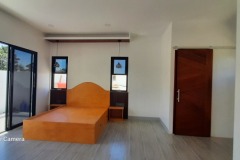
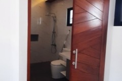
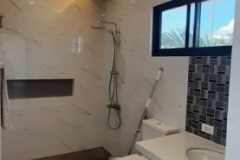
The existing barangay hall finished construction around 2013 in purok Nangka (jackfruit). The previous barangay is now converted into a daycare facility. The logo of the barangay signifies the locals. Historically, people in Cordova lived through fishing even until today. According to statistics gathered by the barangay, over 60 percent today of the locals in barangay Bangbang are still doing fishing for their livelihood.

The structure is oriented towards the north east. The sun rises from the structure’s north east, and settles down on the building’s south west. At noon, the structure experiences heat at its south east which hits the session hall and office of the senior citizens. North east monsoon will be experienced on the structure’s north while southwest monsoon at its south.

The office of the PWD (persons with disability) is relocated to the exterior part of the structure to provide a more spacious and PWD friendly interior. By doing this, the we were able to provide a dedicated PWD comfort room as compared to its previous location.

The waiting area’s allocation remains as is, as it is convenient to the entry. A ceiling fixture is provided all along with sufficient lighting. The previous door for the office of the treasurer was also relocated to provide a bigger space in the waiting area which enables the receptionist to be placed in a more efficient arrangement. A mural of Mariano Sumagang carrying a fallen wood was also painted in the wall as part of the barangay’s history.

Glass panels in the interior of the hallways were redesigned with open air ventilation to enhance air circulation in the area. This design also enables all offices in the ground floor to be cooled together at once, thus helping to cut electricity cost.

The treasurer’s office’s layout is transferred closer to the right side to give way for its new entry. The logo of the barangay is made of gmelina and is placed at the back with illumination on top, surrounded by fluted gmelina panels to bring movement to the area. An existing improvised cabinet can also be seen at the back improvised to make it longer to accommodate more items.

As the existing SK (Sangguniang Kabataan) (Youth Council) Chairman’s office is still unfinished and only has a desk and a chair, we provided a guest chair together with a file cabinet for it to be functional and be able to accommodate visitors. A logo of the Sangguniang Kabataan “SK” is also placed at the back.

We also provided an isolated office for the senior citizens. The office remained located near the exit for safety purposes. This also makes it very convenient for the seniors to access the bathroom as it is just adjacent.

The office of the barangay captain is refurnished. All furniture were replaced and a customized larger desk is made. The desk features mangrove design as the area is abundant with mangroves. A new ceiling fixture is also placed to match

The theme of the interior – The ACU (air conditioning unit) is replaced with a non-wall mounted one as its previous location conflicts with the file cabinet. Fish decorations can also be seen in the file cabinet as fishing has been the main livelihood in the area historically until today. Over 60% of the population are still engaged in fishing.

The councilors’ office is also re-designed to fit three working tables. An ACU is also placed to cool the room. Given that this area is exposed to the east, we took advantage of it by coming up with a “biophilic approach” – connecting with nature.

The layout of the current session hall is changed to maximize space. The arrangement of furniture is also changed into a “u” shape and a ceiling with lighting fixture is added. Doors are also replaced with barn sliding doors to get rid of the space that the door consumes when opened.

Minor offices in the barangay hall are placed in the ground floor. The office of the PWD is
relocated to have a special more PWD-friendly space along with a PWD dedicated comfort room. The entry is then greeted with the reception area where visitors may wait for their appointment before being instructed to proceed to an office.

The treasurer’s offices is relocated near the SK chairman’s entry to provide bigger space for the waiting area and the office of the senior citizen is provided with an isolated room for privacy. Important offices like the councilor’s office, Barangay Captain’s office, and the session hall are then placed in the second floor for hierarchy and bigger space. Three spaces were placed adjacent to each other and a dedicated door to the session hall is placed in the barangay captain’s office. The councilor’s office is allocated in a room where it will be exposed to sunrise as a biophilic design was incorporated in this area.

The session hall consumes the biggest room in this new structure.